Crest or Monogram: Two Ways a Club Can Sign Its Colours
Compare a rugby club crest and monogram by their visual character, club story and best roles, then make a clear choice for formal and everyday identity.
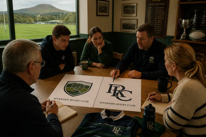
A rugby club crest and monogram announce different kinds of belonging. A crest can bring a place or shared story into view, while a monogram makes the club’s initials its signature; choosing between them starts with the identity the club wants people to recognise.
What does a crest or monogram tell people?
A crest can act like a small piece of club storytelling. A shield, local landmark, animal or other emblem gives the design a visual setting, making it a natural fit for a club whose identity is closely tied to a town, school or founding group.
A monogram puts the club’s initials at the centre. Its character comes from the way the letters meet, overlap or sit together, rather than from a collection of symbols. That can feel direct and personal when players and supporters already associate those letters with the club.
Neither form owns tradition. A crest may carry a story that members have passed down, but a monogram can become just as familiar through years of use on shirts, programmes and clubhouse signs. Ask what the club wants the mark to say about its character, not which format seems more ceremonial.
Which one suits the club’s story?
Start with the details that members would miss if they disappeared. If the club’s relationship with its town is central, a crest might show that connection through a meaningful local feature. If its initials are already a familiar rallying point, a monogram may express the identity more directly.
Then separate shared meaning from decoration. A symbol belongs in a crest when members can explain its connection to the club; an extra flourish that no one can account for may simply add noise. A monogram also needs a reason for its letterforms: unusual overlaps should feel deliberate rather than like a puzzle.
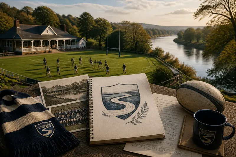
Say a fictional club is known locally for its riverside ground, but its members also use the same two initials on every team sheet. The committee could compare a crest featuring a simple river bend with a monogram that gives the initials a subtle, flowing join. If members recognise the river as part of the club’s story and still read the letters, either direction could serve; if the join makes the initials confusing, the crest may tell that story more plainly.
How can you compare the designs fairly?
Put the crest and monogram beside each other with the same colours, background and level of finish. A polished design can otherwise seem like the stronger idea simply because more attention has gone into drawing it.
- Club story: Check whether members can explain the central symbol or letter treatment. If its meaning is shared and specific, keep it in contention; if it needs a long explanation, simplify the idea or try the other mark.
- Name connection: Check whether the design connects clearly to the club’s name. If the initials are distinctive to members, consider the monogram; if the letters could belong to many clubs, try adding the full name in supporting material or favour a more individual crest.
- Local character: Check whether a place or community feature matters to the club’s identity. If one does, test whether a crest can represent it without becoming a catalogue of symbols; if not, let the initials carry the mark and tell the local story elsewhere.
- Member recognition: Check what players and supporters associate with each design, without prompting them. If one draws out a clear club memory, preserve that element; if reactions differ, ask which meaning matters to the club as a whole and revise accordingly.
- Formal use: Check which design feels at home on a letterhead, presentation board or ceremonial club document. If the crest feels more appropriate there, give it that role; if it looks over-elaborate, use the monogram and keep formal language in the layout.
- Everyday use: Check which design feels natural on a training top or fixture notice. If the monogram reads as the club’s familiar signature, use it in those settings; if it seems anonymous, add the club name nearby or choose the more distinctive crest.
- Shared ownership: Check whether different teams and age groups see themselves in the design. If both marks have strong support, define separate roles for them; if one creates confusion, choose a lead mark and explain its place in club materials.
Imagine a fictional committee comparing a crest with a hill symbol and a monogram made from the club’s initials. Its starting point is that the hill is important to older members, while junior players use the initials on their kit bags. The committee lays both designs beside the club name on a fixture sheet, asks members what each calls to mind, and records the responses: if the hill is recognised as a shared home-place symbol, the crest can lead formal material; if younger players identify the initials more readily, the monogram can serve as the everyday mark. The resulting decision might be a crest for formal documents and a monogram for team kit, with the club name shown alongside either mark when the audience may not know it.
What roles could each mark take?
A club does not have to force every piece of identity into one drawing. A crest may lead on formal material, while a monogram works as a compact signature on kit labels or digital profiles. That arrangement is useful only when each mark has a clear job and members know they belong to the same club.
Another option is to choose one lead mark and use the other only where it adds something distinct. For instance, the crest might appear beside the full name on public notices, while the monogram serves as a small secondary device on team equipment. If both are placed together everywhere, they can compete for attention rather than strengthen recognition.
Write down the roles in plain language: which design leads, which is secondary, and when the club name should appear beside the mark. A short note prevents a new volunteer from treating two approved designs as rival versions.
How should a club handle colour and production?
Colour helps a mark feel like the club, but it should not carry the whole meaning. A crest with several coloured sections may look different when reproduced in one colour; a monogram whose initials rely on contrasting shades may become hard to interpret without them.
Look at the proposed designs in the club’s actual palette and on the materials they are intended for. A sewn badge, a printed programme and a screen display can give the same artwork a different feel. If a design depends on subtle colour distinctions, ask the designer for a clear one-colour version before approving it.
Keep the approved artwork in a shared club folder, alongside a note naming the lead mark and its permitted uses. When commissioning artwork, agree in writing who owns it and how the club may reproduce it; ask the designer or a suitably qualified professional about rights that are unclear.
What questions help settle the choice?
Does a crest always say more about a club?
No. A crest can hold a meaningful local symbol, but a crowded collection of devices may say less than a distinctive set of initials. Choose the form whose story members can explain in a sentence.
Can a monogram work for people new to the club?
It can, though initials may not identify an unfamiliar club on their own. Put the full club name beside the monogram on public-facing material until the mark is familiar to its audience.
Is it confusing to use both designs?
It can be if each appears to claim the same role. Give one mark the lead and describe where the other belongs, so teams and volunteers can use them consistently.
What should the club ask its designer to provide?
Request editable master artwork, versions for one-colour use and light or dark backgrounds, and a written note explaining the approved roles. Confirm ownership and reproduction permissions in writing, especially when an external designer is involved.
How can the club keep its identity coherent?
Once the choice is settled, make a short identity note containing the approved artwork, the full club name and the role of each mark. Include any authorised colour versions and explain which design should lead on formal material and everyday kit.
Store that note with the master files in a location future volunteers can find. Ask teams and event organisers to use the approved artwork rather than redrawing it from a screenshot or adding their own decoration. If the club later wants to change direction, review the proposal openly and update the shared files together.
When you compare a rugby club crest and monogram, look beyond which drawing seems more impressive on its own. The stronger choice is the one that reflects a shared club story and has a clear role wherever members encounter it.